
Brand Identity // Website DesignAllume
Founder Jennifer Chew came to me with years of in-house operations experience and a new vision for her career: helping organizations build sustainable systems without losing sight of the people inside them. Her approach is rooted in understanding how people actually work, supporting personal development, and helping leaders find clarity in complex situations. The goal was to create a brand that felt as thoughtful and human as Jennifer’s approach, while also looking and feeling uniquely different from typical operations and consulting brands.
My role: Creative Director + Brand Designer
Client: Allume
Scope: Brand strategy, visual identity, website design + development, custom graphics, and launch assets
Project Overview
Through my independent design practice, I worked with emerging entrepreneurs to turn early ideas into fully realized brands and digital experiences. Allume was a particularly collaborative project, starting with a new operations consultancy and evolving into a visual identity that made a very human approach to operations strategy feel tangible.
The challenge was to create a brand that felt as thoughtful and human as Jennifer's approach without falling into the expected visual language of operations or consulting. We developed a visual direction around the idea of bringing clarity to uncertainty, using saturated earth and jewel tones, hazy imagery, organic shapes, and unexpected artistic elements to create a brand that felt grounded, expressive, and distinctly personal.
I led the project from initial exploration through website launch, developing the visual identity, website, custom graphics, and supporting brand tools while working closely with Jennifer Chew and copywriter Ashley Strahm throughout the process.
From Uncertainty to Clarity
The visual concept started with a simple idea: Jennifer helps clients bring operational challenges into focus.
That became the foundation for the brand's visual language. Soft gradients, blurred imagery, diffused lighting, and hazy textures create a sense of uncertainty, while clean layouts, generous white space, and structured typography bring clarity and definition.
Rich earth tones grounded the palette, while vibrant jewel tones brought energy and personality. Organic shapes and natural imagery added warmth without relying on predictable landscapes or overly literal nature imagery.
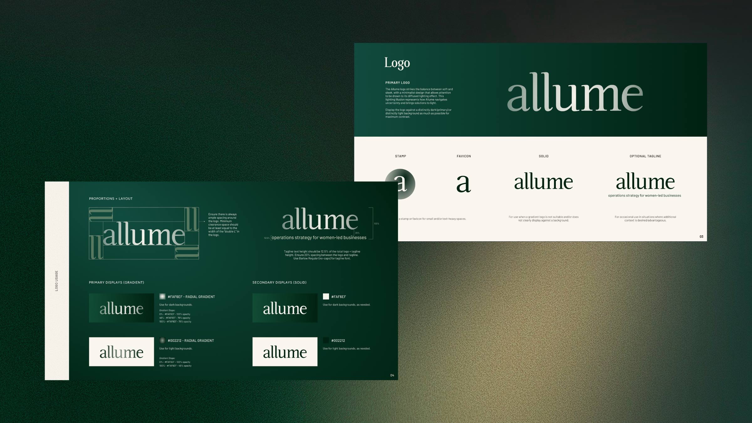
Even the Allume logo carries this idea through its diffused lighting effect, creating a subtle visual metaphor for navigating uncertainty and bringing solutions to light.
Gallery
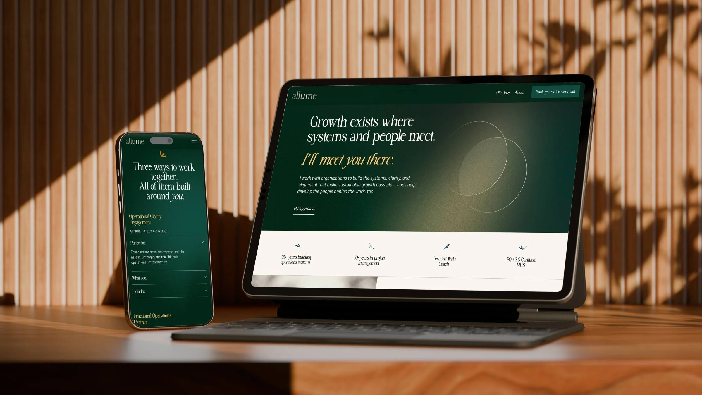
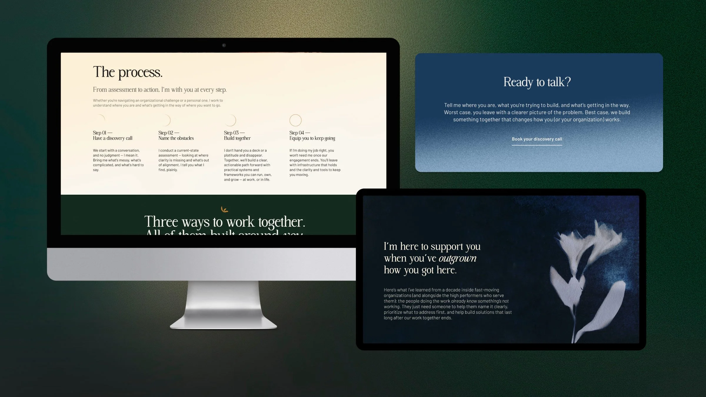
A look at Allume’s visual identity, from original cyanotype artwork and custom illustrations to the finished website.
Design Approach
-
Custom Graphics
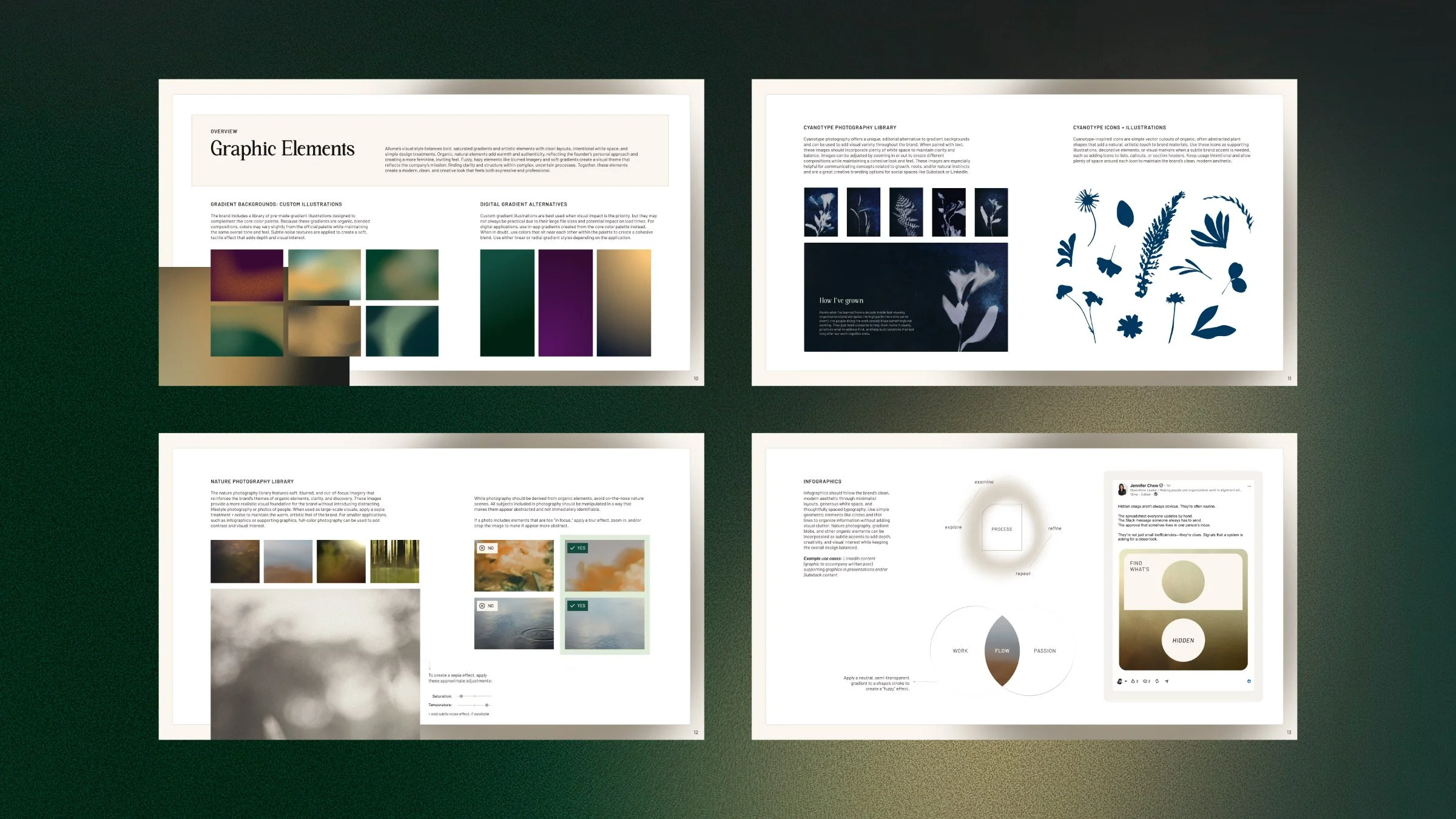
I developed a flexible library of custom visual elements, including gradient illustrations drawn in Procreate, textured backgrounds, abstracted nature imagery, organic icons, and cyanotype-inspired illustrations. Each element was designed to work independently or as part of a larger visual composition.
-
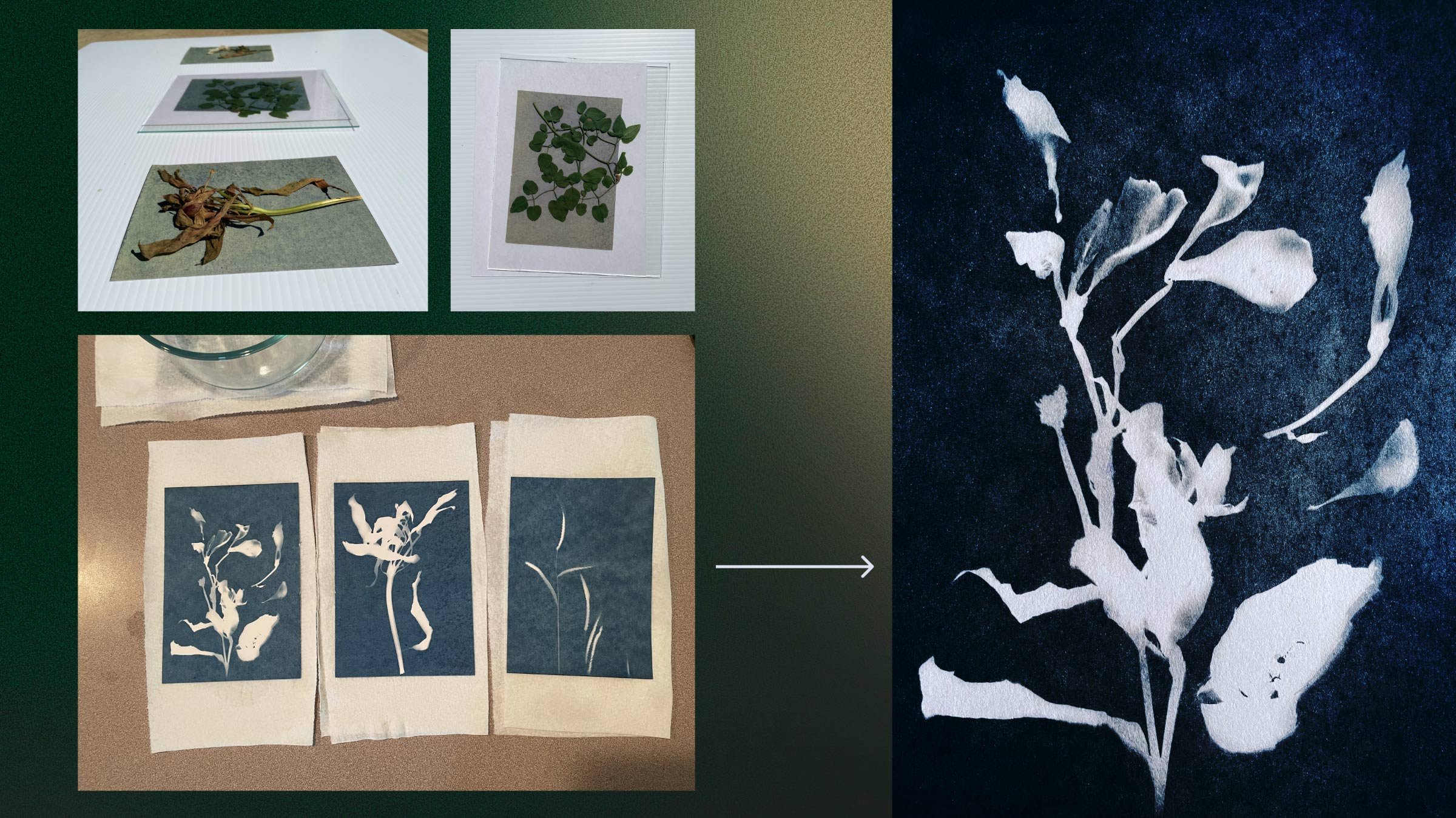
Cyanotype Art
I created physical cyanotype prints using natural forms, then photographed and digitally manipulated them to create a library of textured, editorial-style graphics. I experimented with scale, cropping, texture, and negative space so the images could function as everything from standalone visual moments to backgrounds for text.
-
A Flexible System
The resulting visual system could shift between bold gradients, organic illustrations, abstracted photography, and more minimal compositions while maintaining a consistent look and feel. The brand guidelines documented these elements along with logo usage, typography, color variations, photography direction, and infographic guidance.
Collaboration + Site Build
Ashley Strahm developed the website copy, which gave us a strong foundation for the site's content and messaging. I worked closely with Ashley and Jennifer to translate that content into a clear website structure, making recommendations around UX, hierarchy, content placement, and opportunities to clarify or strengthen the messaging.
I designed and built the site directly in Squarespace, keeping the implementation intentionally flexible and easy for Jennifer to maintain herself. Rather than relying heavily on custom code, I created reusable sections and layouts that could be edited, rearranged, and expanded as the business evolves.
I also created a library of flexible Squarespace components that Jennifer can use to build future pages without starting from scratch.
My Role
-
Brand Identity
Leading initial brand consultation, mood board development, and creative exploration
Developing the visual identity, logo system, color palette, typography, and extended visual system
Creating custom gradient illustrations and graphic elements in Procreate
Creating and digitally manipulating original cyanotype photography
Developing abstract botanical icons and art-directing the brand's photography library
-
Website + Content
Collaborating with copywriter Ashley Strahm on website messaging, hierarchy, and content structure
Designing and developing the Squarespace website
Creating reusable website components for future use
Guiding the client through Squarespace and domain setup
Providing creative direction for the client's new headshot and designing LinkedIn branding and launch assets
-
Brand Systems + Handoff
Creating brand guidelines and a flexible visual asset library
Building a flexible brand system designed for client independence
Developing flexible visual assets for future applications
Creating supporting launch templates and digital assets
Designing the system so the brand could be maintained and expanded without starting from scratch
Results
A Brand with a Point of View
Allume launched with more than a logo and a website. It had a visual language that could communicate Jennifer's approach before a potential client ever spoke with her. The combination of expressive graphics, thoughtful structure, and a deliberately human visual direction helped position operations strategy as something more nuanced than processes and systems.
The result was a brand that felt unmistakably personal to Jennifer while still giving Allume the credibility of an established consultancy. Rather than leaning into the typical visual language of operations and business consulting, we created something warmer, more artistic, and more reflective of the way Jennifer works: thoughtful, curious, people-centered, and comfortable finding clarity in complexity.
Built to Evolve
Because Allume was a new business, the brand needed to be flexible enough to grow with it. Alongside the core identity and website, I created LinkedIn branding, featured-image templates, and a website launch announcement template to give Jennifer a starting toolkit for introducing the business across digital channels.
Most importantly, the brand and website were built with future updates in mind. Jennifer can edit the Squarespace site herself, pull from the established visual library, and create new pages and materials without having to reinvent the brand each time.
“I absolutely loved every minute working with you! I really enjoyed the exploration process and developing my brand aesthetic together. Your attention to detail and thoughtfulness from not only an artistic standpoint but also from a practical one was so appreciated. You design intentionally and you were so kind to include me in the process. The collaboration made this so much more fun. Having you as a guide and cheerleader made me feel excited about launching something so personal.”